Embark on a journey to unlock the secrets of impactful branding! This guide explores logo design, from historical roots to current trends,
and legal aspects.
What is a Logo and Why Does it Matter?
A logo is far more than just a pretty picture; it’s the cornerstone of a brand’s identity, a visual shorthand communicating your values, personality, and promise to customers. It’s the first thing many people will associate with your business, making a powerful initial impression.
Why does it matter? A well-designed logo fosters recognition, builds trust, and differentiates you from competitors. It’s a crucial element in marketing, appearing on everything from business cards and websites to packaging and social media. A strong logo contributes significantly to brand loyalty and overall business success, acting as a silent ambassador for your company’s ethos.
Essentially, a logo is an investment in your brand’s future, representing its core essence in a memorable and impactful way.
The History of Logo Design
Early origins trace back to ancient civilizations utilizing symbols for identification – think family crests and trade guilds’ marks. However, modern logo design truly blossomed with the Industrial Revolution, as businesses needed to distinguish themselves in a burgeoning marketplace.
The late 19th and early 20th centuries saw the rise of typography-focused logotypes, emphasizing brand names. The Bauhaus movement heavily influenced logo aesthetics, promoting simplicity and functionality. Post-World War II, designers like Paul Rand pioneered the concept of the logo as a strategic asset, creating iconic marks for IBM and UPS.
The digital age brought new possibilities, with vector graphics and software revolutionizing the design process. Today, logo design continues to evolve, reflecting current cultural and technological trends.

Understanding Logo Design Principles
Effective logos hinge on core principles: color psychology, typography, shape symbolism, and strategic use of negative space – all working harmoniously for brand impact.
Color Psychology in Logo Design
Color profoundly impacts perception and evokes specific emotions, making it crucial in logo design. Red often signifies excitement, energy, and passion, ideal for brands wanting to appear bold. Blue conveys trust, stability, and calmness, frequently used by corporate entities.
Green is associated with nature, growth, and health, appealing to eco-conscious brands. Yellow represents optimism and happiness, grabbing attention but needing careful balance. Purple suggests luxury, creativity, and wisdom, often favored by high-end brands.
Black embodies sophistication, power, and elegance, while white symbolizes purity and cleanliness. Understanding these associations allows designers to strategically select colors that resonate with the target audience and reinforce the brand’s message, ultimately influencing brand recognition and recall.
Typography: Choosing the Right Fonts
Font selection is paramount; it’s not merely about aesthetics but conveying personality. Serif fonts, like Times New Roman, project tradition, authority, and respectability – suitable for established brands. Sans-serif fonts, such as Helvetica or Arial, appear modern, clean, and approachable, fitting contemporary businesses.
Script fonts evoke elegance, creativity, and a personal touch, best used sparingly for luxury or artistic brands. Display fonts are unique and eye-catching, ideal for logos needing strong visual impact, but readability is key.
Consider font pairing – combining complementary fonts enhances visual appeal. Ensure legibility across various sizes and platforms. Typography must align with the brand’s overall identity and target audience, reinforcing the message and creating a lasting impression.
Shape and Symbolism in Logo Creation
Shapes profoundly impact logo perception. Circles and ellipses convey unity, completeness, and friendliness, often used by community-focused brands. Squares and rectangles represent stability, reliability, and structure – favored by corporate entities.
Triangles symbolize dynamism, energy, and progress, suitable for innovative companies. Abstract shapes offer uniqueness but require careful consideration to avoid misinterpretation. Symbolism adds layers of meaning; a tree might represent growth, while a bird signifies freedom.
Cultural context matters; symbols can have different meanings across regions. Ensure chosen shapes and symbols align with the brand’s values and resonate with the target audience, creating a memorable and meaningful visual identity.
Negative Space: Utilizing the Empty Areas
Masterful logo design leverages negative space – the empty areas surrounding and within elements. It’s not simply “blank” space, but an active design component. Clever use creates hidden imagery or reinforces the brand message subtly.
Effective negative space enhances memorability and visual appeal. Iconic logos, like the FedEx arrow, demonstrate its power. It adds sophistication and demonstrates a designer’s skill. Avoiding clutter is crucial; ample negative space improves readability and prevents a busy appearance.
Consider how the logo will appear across various sizes and backgrounds. Well-utilized negative space ensures clarity and impact, even in small formats, contributing to a polished and professional brand identity.
Types of Logos
Explore diverse logo styles: wordmarks, lettermarks, brand marks, abstract designs, combination marks, and emblems – each offering unique branding opportunities and visual impact.
Wordmarks (Logotypes)
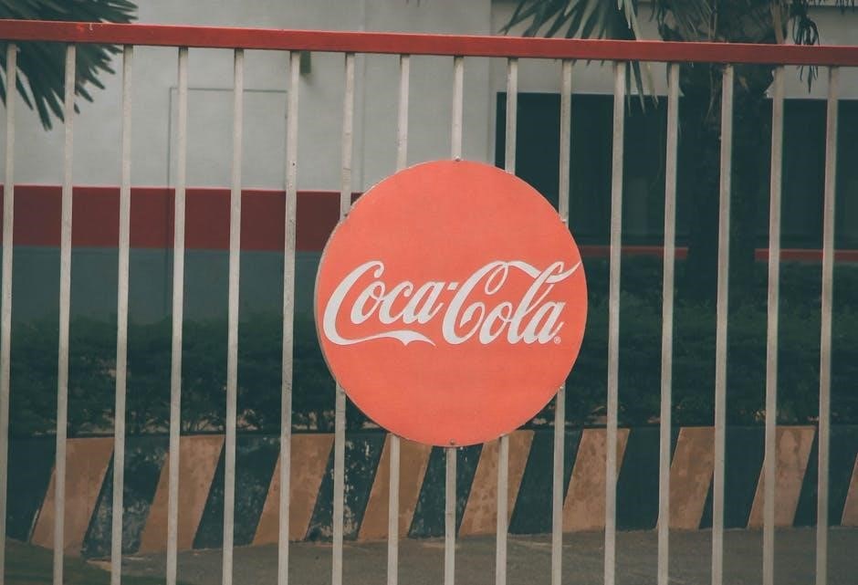
Wordmarks, also known as logotypes, are logos that solely consist of a company’s name styled in a unique and recognizable way. These designs prioritize typography, focusing on font choice, letter spacing, and overall visual aesthetic to convey brand personality.
Successful wordmarks, like Coca-Cola or Google, become instantly identifiable, leveraging the power of a well-crafted typeface. They are particularly effective for businesses with distinctive and relatively short names. The key is to select a font that reflects the brand’s values – whether it’s classic, modern, playful, or sophisticated.
Consider kerning (the space between letters) and leading (the space between lines) to ensure readability and visual harmony. A strong wordmark doesn’t require additional imagery; the name itself is the brand.
Lettermarks (Monogram Logos)
Lettermarks, or monogram logos, utilize a company’s initials to create an abstract and memorable mark. This approach is ideal for organizations with lengthy or complex names, offering a concise visual representation. Think HBO, IBM, or CNN – instantly recognizable despite using only a few letters.
Effective lettermark design hinges on careful font selection and the interplay between the chosen initials. Designers often experiment with overlapping, interlocking, or creatively modifying the letters to achieve a unique aesthetic.
Consider the visual balance and readability of the monogram. A well-executed lettermark conveys sophistication and professionalism, often appearing on stationery, business cards, and as a subtle brand element. They are particularly strong when brand recognition is already established.
Brand Marks (Pictorial Marks)
Brand marks, also known as pictorial marks, are logos that utilize a recognizable image or symbol to represent a brand. These logos are instantly recognizable and can transcend language barriers, making them ideal for global brands. Think of Apple’s apple, Twitter’s bird, or Nike’s swoosh – iconic images that immediately evoke their respective brands.
The key to a successful pictorial mark lies in choosing an image that is relevant to the brand’s identity and values. The image should be simple, memorable, and easily scalable.
While effective, pictorial marks require strong brand recognition to function independently. They are often best suited for established companies with a clear brand identity.
Abstract Logos
Abstract logos move beyond recognizable imagery, employing geometric forms and artistic representations to convey a brand’s essence; Unlike pictorial marks, they don’t depict concrete objects; instead, they rely on shapes, colors, and forms to communicate abstract ideas and emotions. Pepsi’s globe and Adidas’ three stripes are prime examples.
Creating an effective abstract logo requires a deep understanding of design principles and brand identity. The chosen forms must be carefully considered to evoke the desired feelings and associations.
These logos offer greater creative freedom but demand strong brand building to establish meaning and recognition. They are excellent for brands aiming for a modern, innovative image.
Combination Marks
Combination marks cleverly pair a wordmark (company name) with a pictorial mark, brand mark, or abstract logo. This versatile approach offers the benefits of both elements – immediate brand recognition through the name and visual impact through the symbol. Burger King’s logo, featuring the name nestled within the bun shapes, is a classic example.
These logos are particularly useful for newer brands needing to quickly establish name recognition. The symbol can eventually become recognizable on its own, allowing for simplified logo variations later on.
Careful balance is crucial; the symbol shouldn’t overshadow the name, and vice versa. A well-executed combination mark is both memorable and informative.
Emblems
Emblems feature text integrated within a symbol or icon, often resembling seals, badges, or crests. Historically popular with universities, automotive brands, and organizations, emblems convey tradition, authority, and prestige. Harley-Davidson’s iconic bar and shield logo is a prime example, instantly recognizable and steeped in brand history.
While visually striking, emblems can be less versatile than other logo types. Their detailed nature doesn’t always translate well to small sizes or various applications. However, when executed effectively, they create a strong, lasting impression.
Emblems work best for brands aiming to project a sense of heritage and established trustworthiness.

The Logo Design Process
From initial concepts to final delivery, a structured process ensures a successful logo. It involves briefing, sketching, digital refinement, feedback, and finalization.
Client Briefing and Research
The foundation of any successful logo lies in a thorough client briefing and comprehensive research phase. This initial stage is crucial for understanding the client’s vision, target audience, and brand values. A detailed questionnaire should explore the company’s history, mission, and long-term goals.
Research extends beyond the client’s direct competitors; it encompasses industry trends, cultural nuances, and potential symbolism. Analyzing competitor logos helps identify opportunities for differentiation. Understanding the target demographic’s preferences – colors, styles, and messaging – is equally vital. This research informs the design direction, ensuring the logo resonates with the intended audience and accurately reflects the brand’s identity. A well-executed briefing and research phase saves time and resources later in the process.
Sketching and Conceptualization
Following the research phase, the sketching and conceptualization stage brings ideas to life. This is where designers explore a multitude of concepts, rapidly iterating through various forms, symbols, and layouts. The emphasis is on quantity over quality initially, encouraging a broad range of possibilities.
Hand-drawn sketches are invaluable for quickly visualizing ideas without the constraints of digital tools. These sketches should explore different visual metaphors and represent the brand’s core values. Once a promising direction emerges, concepts are refined and developed further. Exploring variations in typography and color palettes begins at this stage. The goal is to generate a diverse collection of logo concepts ready for digital translation and client presentation.
Digital Design and Refinement
Transitioning from sketches, the digital design phase utilizes vector-based software like Adobe Illustrator or Affinity Designer. This allows for scalability without loss of quality – crucial for logo versatility. Initial concepts are meticulously recreated digitally, focusing on precision and clean lines.
Refinement involves careful attention to detail: kerning of typography, color adjustments, and shape optimization. Designers explore variations, ensuring the logo functions effectively across different applications – from website headers to business cards. Multiple iterations are common, with continuous evaluation against the initial brief and brand guidelines. This stage demands technical skill and a keen eye for aesthetics, resulting in polished, professional logo options.
Presentation and Feedback
Presenting logo concepts to the client is a pivotal moment. Designers typically prepare mockups showcasing the logo in real-world applications – on stationery, packaging, and digital platforms. A clear rationale behind each design choice is essential, explaining how it aligns with the brand’s identity and target audience.
Constructive feedback is actively solicited. Designers must listen attentively, understanding the client’s perspective and concerns. Revisions are often necessary, requiring flexibility and a collaborative spirit. Managing expectations is key; explaining design principles and limitations helps ensure a positive outcome. This iterative process refines the logo, ensuring client satisfaction and a strong brand representation.
Finalization and Delivery
Upon client approval, the logo design enters its finalization stage. This involves meticulous preparation of all necessary file formats – vector files (AI, EPS, SVG) for scalability, and raster files (PNG, JPG) for web and print. Color codes (CMYK, RGB, HEX) are precisely documented, ensuring consistent brand representation across all media.
A comprehensive logo usage guideline document is crucial. It outlines proper logo application, including size restrictions, color variations, and prohibited alterations. These guidelines safeguard brand integrity. Finally, all files and the usage guide are delivered to the client, marking project completion and empowering them to effectively utilize their new visual identity.
Logo Design Trends (as of 02/12/2026)
Current trends showcase minimalism, geometric forms, and vibrant gradients. Vintage aesthetics are also resurfacing, blending nostalgia with modern design principles for unique branding.
Minimalism and Simplicity
The enduring appeal of minimalism in logo design stems from its ability to convey core brand values with clarity and impact. As of February 12, 2026, this trend continues to dominate, favoring clean lines, ample white space, and a reduction of unnecessary elements.
This approach ensures logos are memorable, versatile across platforms, and easily recognizable, even at small sizes. Simplicity isn’t merely aesthetic; it’s about effective communication. Brands are increasingly opting for streamlined designs that prioritize functionality and timelessness over elaborate ornamentation.
The focus is on distilling the essence of a brand into its most fundamental visual representation, creating a lasting impression through understated elegance; This trend reflects a broader cultural shift towards intentionality and a rejection of visual clutter.
Geometric Shapes
A prominent trend in logo design as of February 12, 2026, is the sophisticated use of geometric shapes. Circles, squares, triangles, and hexagons are being employed not just as aesthetic elements, but as building blocks to convey specific meanings and brand attributes.
These shapes offer a sense of structure, stability, and modernity. Triangles can represent dynamism and progress, while circles often symbolize unity and completeness. The strategic combination of these forms allows designers to create visually compelling logos that resonate with target audiences.
Furthermore, geometric designs lend themselves well to scalability and adaptability, ensuring logos remain effective across various applications. This trend reflects a desire for logos that are both visually striking and conceptually grounded.
Gradient Usage
As of February 12, 2026, gradients are experiencing a significant resurgence in logo design, moving beyond the simplistic transitions of the past. Designers are now employing complex, multi-hued gradients to add depth, dimension, and a sense of modernity to brand identities.
These aren’t merely aesthetic choices; gradients are used to symbolize transformation, innovation, and the blending of ideas. Subtle gradients can create a feeling of sophistication, while bolder combinations can convey energy and excitement. The key is thoughtful application.
However, designers must be mindful of accessibility and legibility when utilizing gradients, ensuring sufficient contrast for clear visibility across all platforms and media. This trend demonstrates a move towards more nuanced and visually rich logo designs.
Vintage and Retro Styles

A notable trend as of February 12, 2026, is the resurgence of vintage and retro aesthetics in logo design. This isn’t simply replicating past styles, but rather drawing inspiration from specific eras – Art Deco, Mid-Century Modern, and even Victorian designs – and reinterpreting them for contemporary audiences.
Designers are utilizing classic typography, color palettes reminiscent of bygone eras, and illustrative elements that evoke nostalgia and a sense of heritage. This approach is particularly effective for brands aiming to convey trustworthiness, quality, and a connection to tradition.
The appeal lies in the perceived authenticity and craftsmanship associated with these styles, offering a refreshing alternative to overly sleek and minimalist designs. Careful execution is crucial to avoid appearing dated or cliché.
Legal Considerations for Logos
Protect your brand identity! Understand trademarking, copyright, and usage guidelines to ensure exclusive rights and prevent legal issues regarding your logo design.
Trademarking Your Logo
Securing your logo with a trademark is a crucial step in protecting your brand’s identity and preventing others from using a similar design. This legal process grants you exclusive rights to use the logo in connection with specific goods or services. Before filing, conduct a thorough search to ensure your logo doesn’t infringe on existing trademarks.
The trademarking process typically involves filing an application with the relevant intellectual property office, such as the United States Patent and Trademark Office (USPTO). Expect a review period where your application is examined for potential conflicts. If approved, your trademark will be registered, providing significant legal protection. Remember, trademark rights are geographically limited, so consider filing in key markets where you operate.
Copyright and Ownership
Copyright automatically protects original works of authorship, including logo designs, the moment they are fixed in a tangible medium. This means the creator of the logo generally owns the copyright. However, if the logo was created as a “work made for hire” – for example, by a designer under contract – the client typically owns the copyright.
Understanding ownership is vital. A clear contract with your designer should explicitly state who owns the copyright to the final logo. Copyright protects the artistic expression of the logo, not the brand identity itself (that’s where trademarking comes in). While copyright exists automatically, registering your copyright with the appropriate authority provides additional legal benefits, like the ability to sue for statutory damages in case of infringement.
Logo Usage Guidelines

Establishing clear logo usage guidelines is crucial for maintaining brand consistency. These guidelines dictate how your logo should and shouldn’t be used across all platforms. Specify acceptable color variations – primary, secondary, and grayscale – and provide precise color codes (Pantone, CMYK, RGB, Hex).
Define minimum size requirements to ensure legibility, and outline prohibited alterations like stretching, skewing, or changing colors without approval. Include examples of correct and incorrect usage, demonstrating appropriate spacing, background considerations, and forbidden modifications. Distribute these guidelines to all employees, partners, and vendors who may interact with your brand. Consistent application strengthens brand recognition and protects your visual identity.

Resources for Logo Design
Explore diverse tools! From online logo makers for quick solutions to professional designers and vibrant communities, find support for your logo journey.
Online Logo Makers
For those seeking swift and affordable solutions, online logo makers present a compelling option. These platforms, often subscription-based or offering one-time purchase options, empower users with limited design experience to create logos independently. They typically feature extensive libraries of pre-designed icons, fonts, and customizable templates.
However, it’s crucial to acknowledge the limitations. While convenient, logos generated through these tools can lack originality, potentially resembling designs used by others. Customization options, though plentiful, may not offer the nuanced control a professional designer provides. Consider these tools ideal for startups or projects with constrained budgets, but prioritize thorough research to ensure uniqueness and avoid potential trademark conflicts. Remember to carefully review usage rights and licensing agreements before finalizing your design.
Hiring a Professional Logo Designer
Investing in a professional logo designer yields substantial benefits, particularly for businesses prioritizing a unique and impactful brand identity. Experienced designers possess the expertise to translate your brand values and target audience into a visually compelling symbol. They navigate complex design principles, ensuring scalability, memorability, and versatility across various platforms.
The process typically involves a collaborative briefing, conceptualization, and iterative refinement stages. Expect to discuss your brand’s personality, competitors, and desired aesthetic. A skilled designer will present multiple concepts, incorporating feedback to deliver a final logo that truly represents your vision. While a higher initial investment, a professionally crafted logo offers long-term value and avoids the pitfalls of generic, off-the-shelf solutions.
Logo Design Communities and Forums
Engaging with logo design communities and forums provides invaluable opportunities for learning, feedback, and networking. These platforms connect aspiring and seasoned designers, fostering a collaborative environment for sharing knowledge and critiquing work. Online forums often host discussions on current trends, software techniques, and industry best practices, keeping you informed and inspired.
Platforms like Behance and Dribbble showcase diverse logo designs, offering a wealth of visual inspiration. Participating in critiques allows you to refine your skills and gain constructive feedback from peers. Furthermore, these communities can be excellent resources for discovering talented designers or finding potential collaborators. Remember to contribute positively and respect the community guidelines for a rewarding experience.